Firepoint
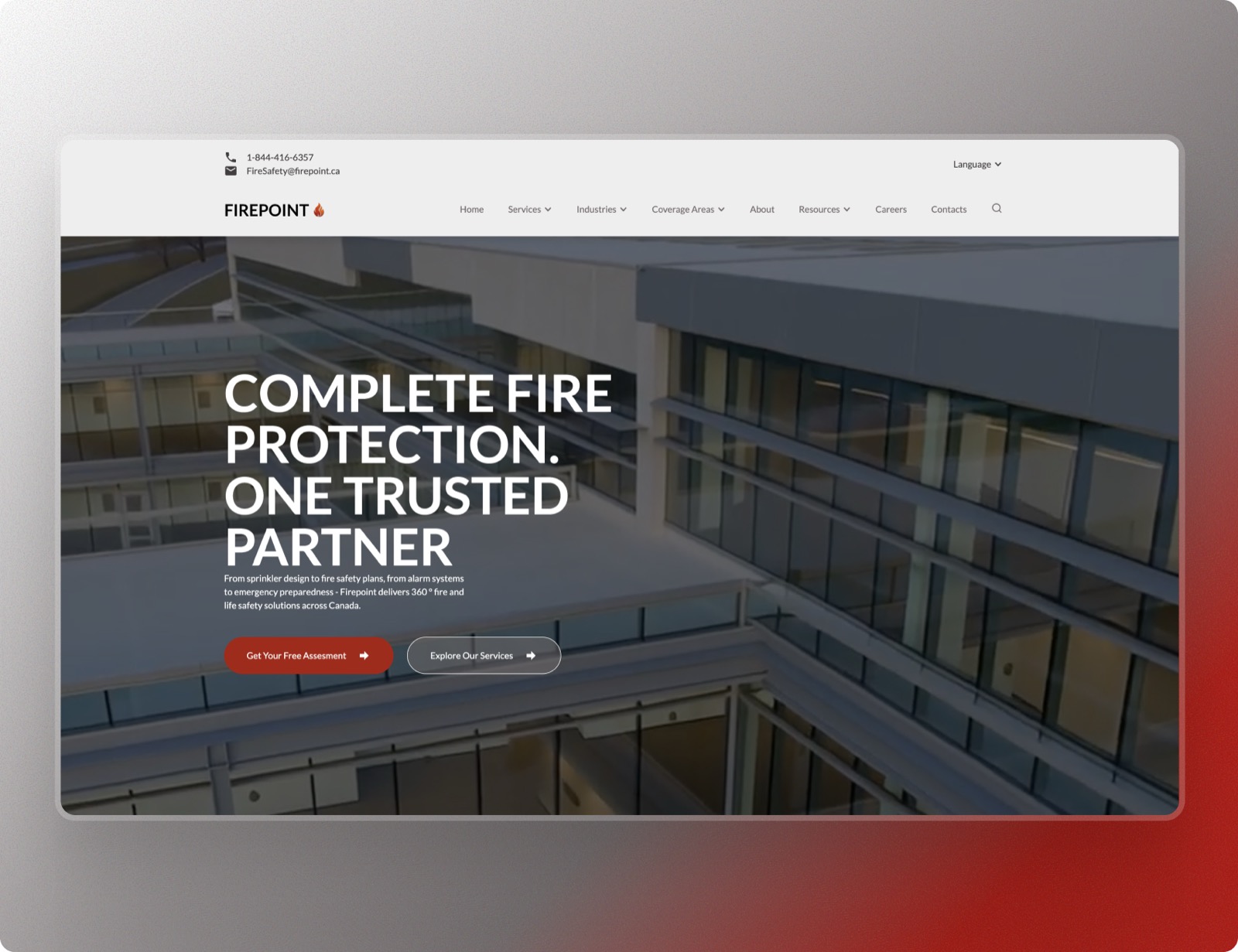
Firepoint delivers complete fire protection through one trusted partner — and their website embodies that promise with unwavering authority. The design commands attention through bold uppercase typography set against dramatic architectural photography, creating an immediate sense of professional competence and scale.
"Complete fire protection. One trusted partner. — A promise made visible."
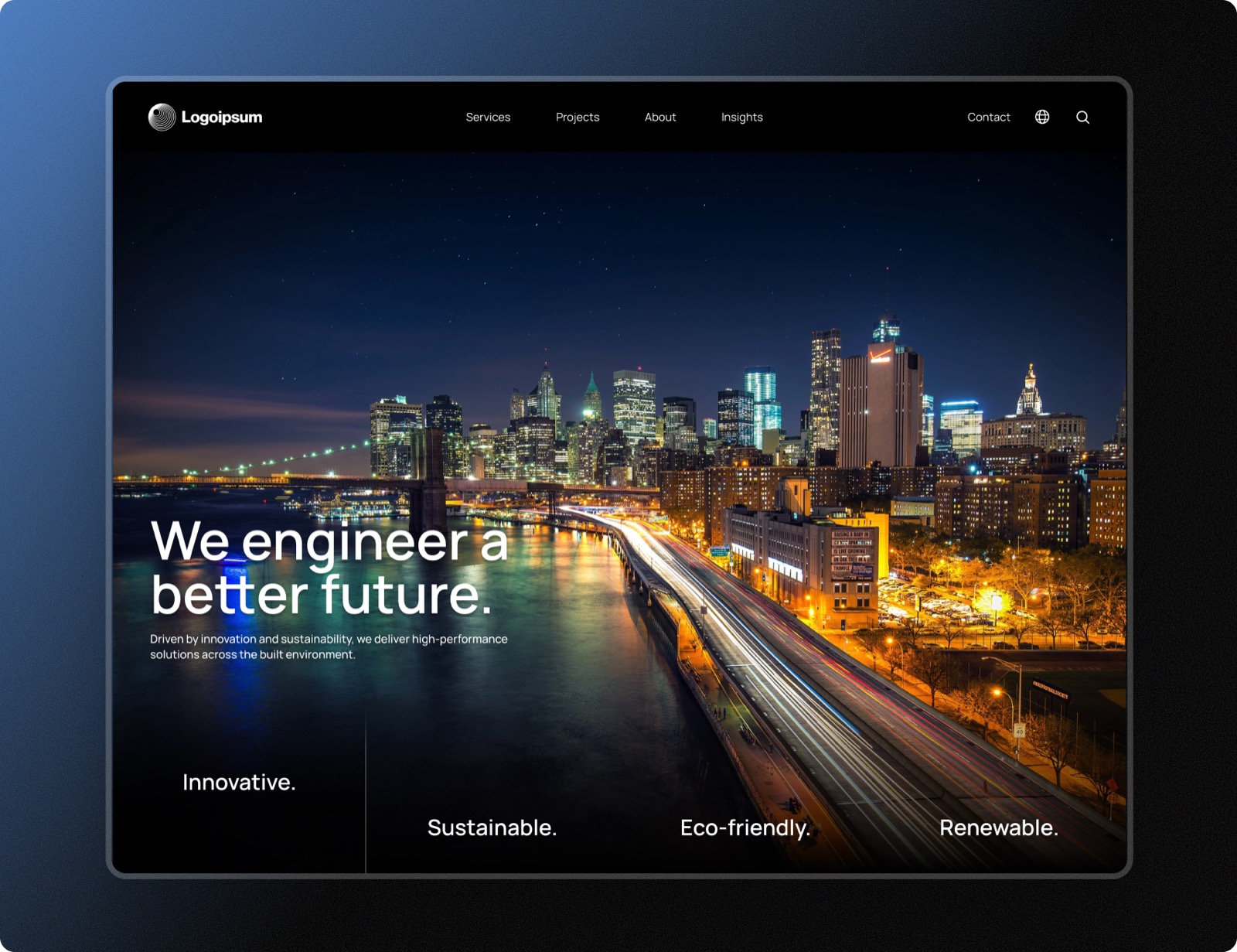
The hero section opens with a powerful perspective shot of a modern commercial building, its angular glass facades catching light and shadow. This isn't decorative imagery — it's a statement about the caliber of projects Firepoint protects. The white headline punches through the scene with absolute clarity: no ambiguity, no hesitation.
Strategic red accents anchor the design — appearing in the logo's flame icon and the primary call-to-action button — creating an immediate visual association with fire while maintaining sophistication. The secondary navigation offers comprehensive pathways: Services, Industries, Coverage Areas, Resources, and Careers, signaling the depth of expertise behind the brand.
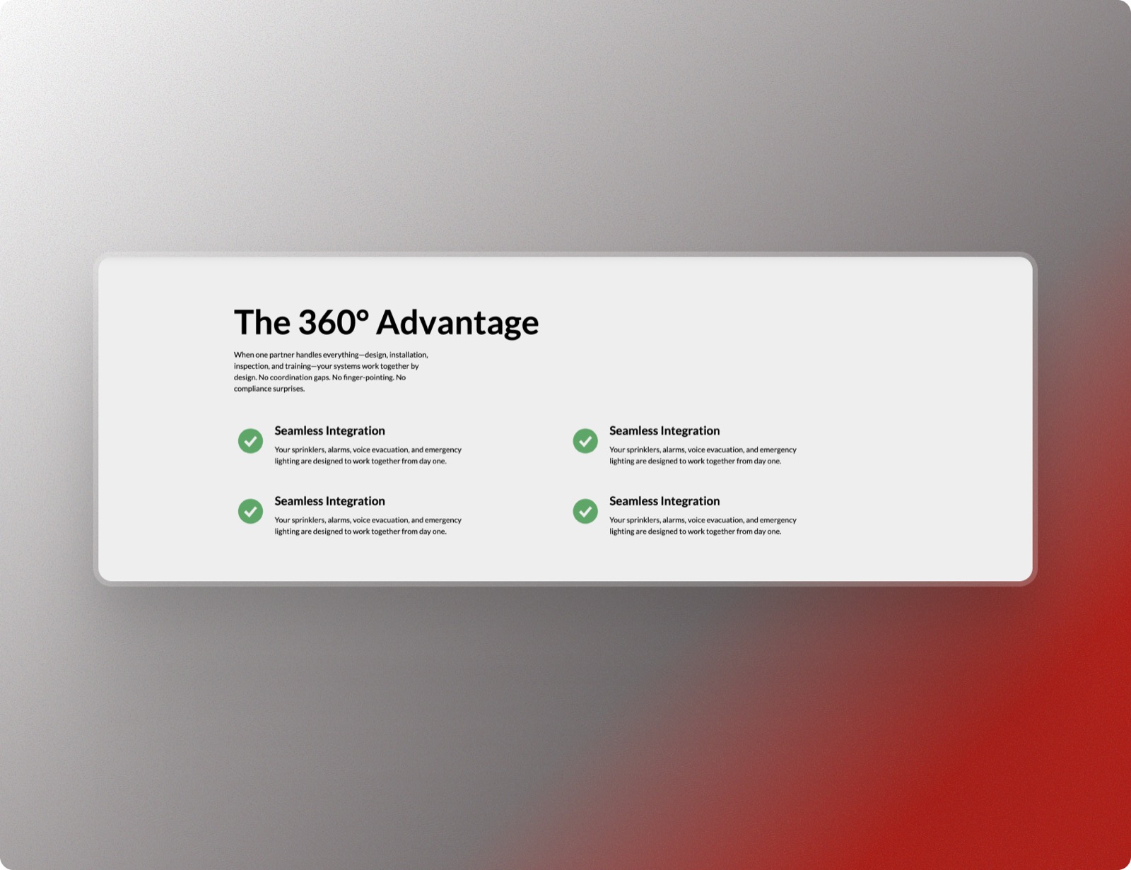
"From sprinkler design to emergency preparedness — delivering 360° life safety solutions."
Contact information sits prominently in the header — phone number and email visible at first glance — because in this industry, accessibility isn't a feature, it's a responsibility. The dual-button approach offers clear paths: get a free assessment or explore services, meeting visitors wherever they are in their decision journey.